Wednesday, 17 October 2012
Monday, 15 October 2012
THIS WEEK'S WORK
This week's work:
The quality for the poster and digipak should be as good as you can (i.e. colour prints on decent paper) and the digipak needs to be folded to ensure that it actually works as a digipak!
Any problems, see Mr Smith or myself BEFORE Friday, not on the day. Ensure you have sufficient printer credit, id card etc to enable the practical pieces to be handed in as smoothly as possible for you!! We will mark them over half term and give marks back
- you should be filming YOUR VIDEO outside of lesson time. If you haven't started, then NOW is the time. You should at least have your locations booked, dates made with your 'stars' in your video and costumes/props booked and organised. Half-term is an ideal time to get some filming done without lessons interrrupting etc.
- 3 x analysis of digipaks and 3x analysis of music posters should be on blogs. Look at the example I have posted for ideas.
- Friday 19th October is the deadline for your DRAFT digipak and DRAFT poster. These will need to be on Blogs and PRINTED, NAMED AND HANDED INTO THE ENGLISH OFFICE BY 3.30PM ON FRIDAY 19TH.
The quality for the poster and digipak should be as good as you can (i.e. colour prints on decent paper) and the digipak needs to be folded to ensure that it actually works as a digipak!
Any problems, see Mr Smith or myself BEFORE Friday, not on the day. Ensure you have sufficient printer credit, id card etc to enable the practical pieces to be handed in as smoothly as possible for you!! We will mark them over half term and give marks back
Tuesday, 9 October 2012
Monday, 8 October 2012
Wednesday, 3 October 2012
Digipak and Poster
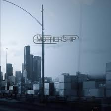
You need to analyse 3x CD covers/digipaks and 3x adverts/posters advertising new albums.Include your choices on your blog with detailed observations.
Tips: Digipak
Tips: Digipak
- choose covers which inspire you and are preferably in the same genre as your band/artist
- analyse colour palette and possible reasons behind it
- analyse connotations of names of bands and song titles and album name
- analyse layout, font, positioning of image(s)
- what is the image and what is the link to the band? Is there a sense of branding across their products? Why?
- are there any bonus tracks, freebies, posters , lyrics included?
- where did you find the poster? i.e. the magazine it came from/billboard/shop window etc
- coment on the layout ( think back to AS work on Golden Spiral, HOW it is intended to be read)
- comment on the colour palette and reasons behind this
- comment on font style/size (graphology) and its effectiveness
- analyse the image carefully. What/who does it depict and what is the intended audience supposed to feel?
- who, if anyone, has reviewed the album? why is this included?
Monday, 1 October 2012
Subscribe to:
Comments (Atom)


